he National and International success of the Nando’s Casa (Restaurant) Design is based on a collaborative approach to the design by the client and their creative teams. The teams consist of the client design team, a group of national and international designers, furniture and product designers and finally local artists. This approach stimulates a unique design proposal for each Casa (restaurant) without loosing sight of the common brand identity.
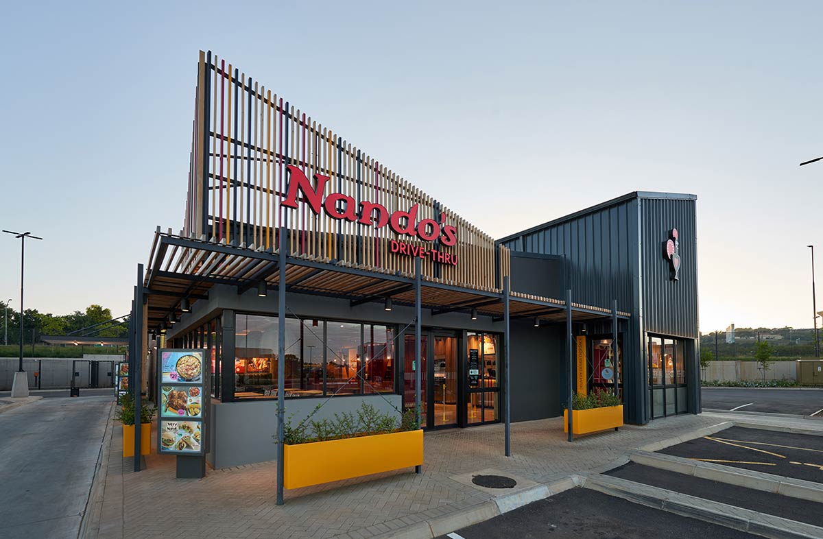
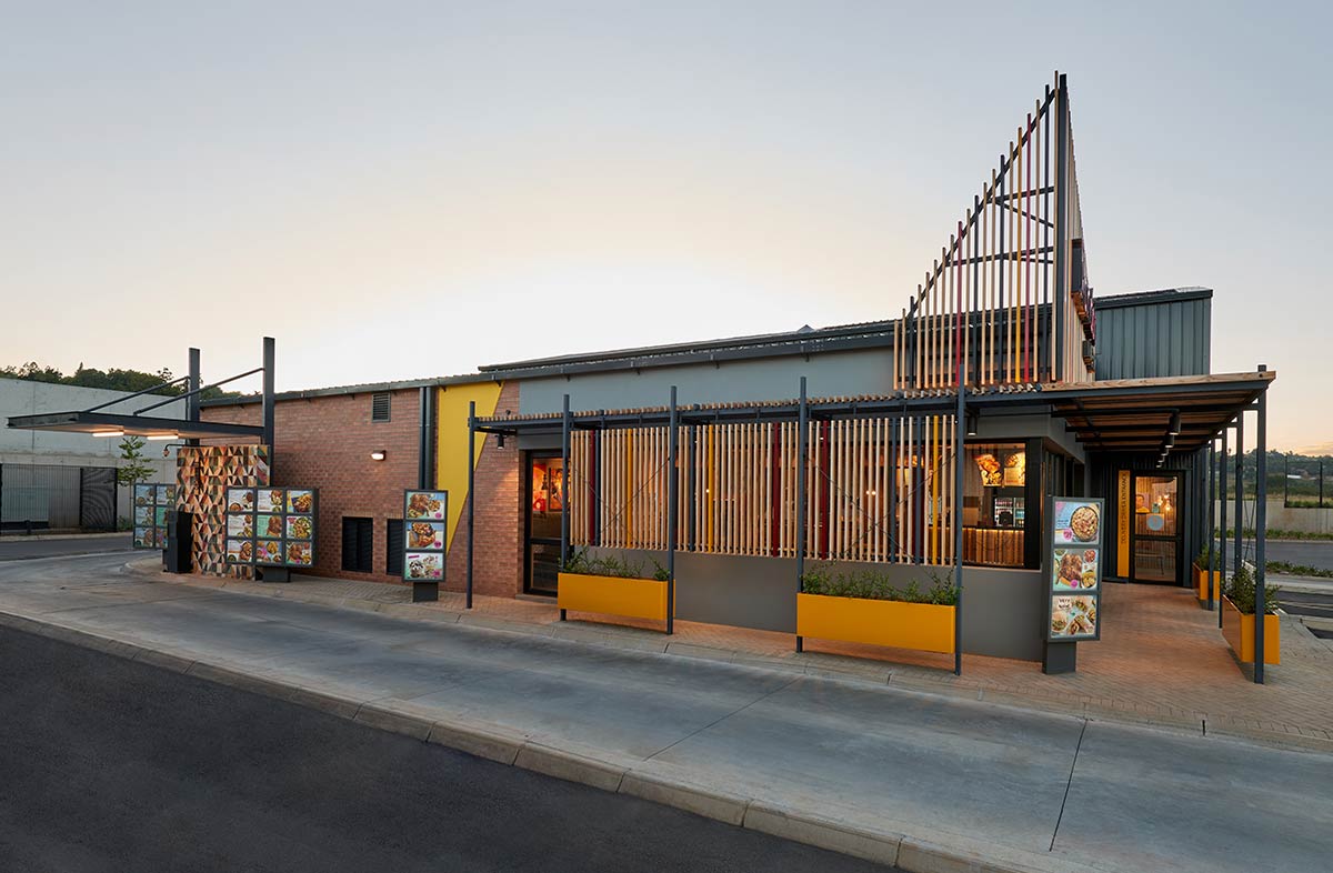
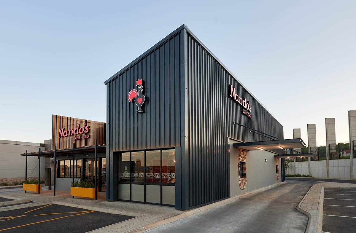
The concept for the new Nando’s drive-through at the Castle Gate Shopping Centre was rooted in the intent to increase brand visibility and simultaneously setting it apart from other generic drive through offerings. The building was specifically articulated by paying attention to the massing of the different elements. The service core of the building was elongated with a slanted mono pitch roof to add visual prominence to the building. The core is highlighted by cladding it entirely in corrugated sheeting, while the dining section was lowered to a comfortable human scale.
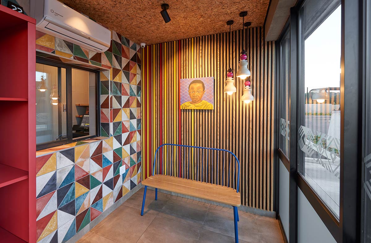
The slanted shape of the roof tower inspired the use of triangles as a design feature, which directed elements in both the exterior finishes and interior design. Timber slats were used to vertically clad the pedestrian entrance of the building and create a recognizable entrance to visitors, while its sloped shape creates a sense of balance against the building core. Floating steel planters soften the barrier between the walkway and the parking area, and the order and collection windows are made more pronounced with a vibrant local, handmade tile surround.
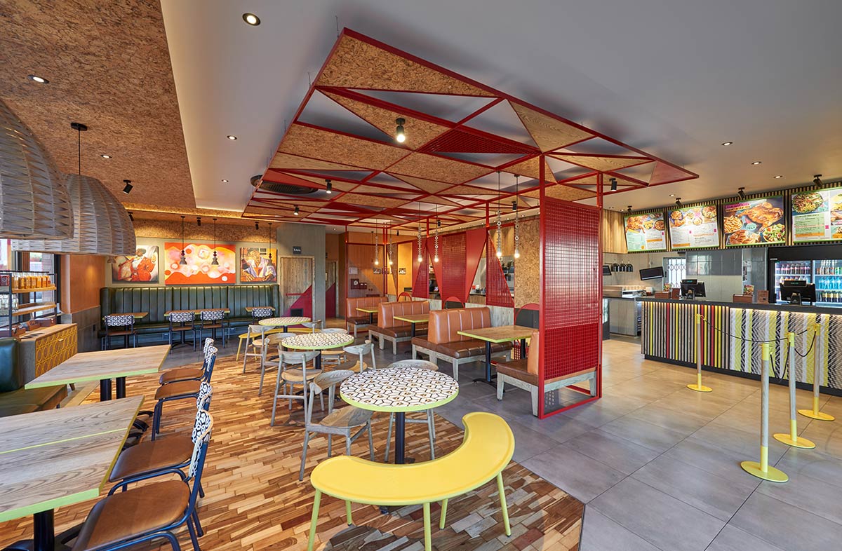
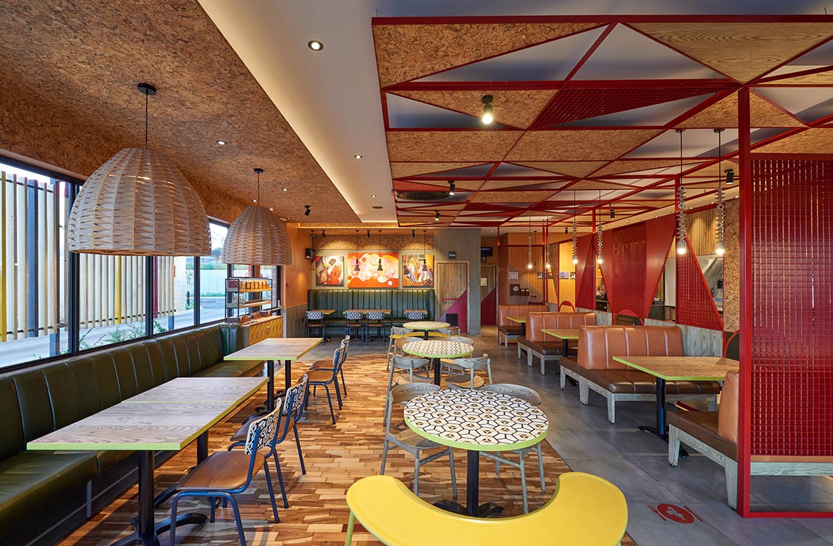
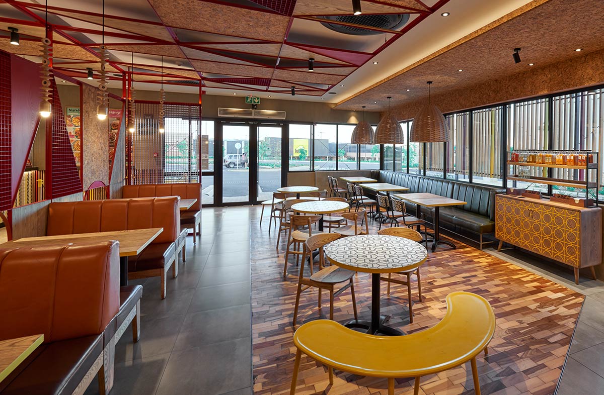
In the interior, the triangular shape inspired the structure for the daring red room-dividing screen and suspended bulkhead. This oxblood red structure is used to draw patrons into the space and motivates to spend more time in the interior.
Texture is added by including rich terracotta and green leather upholstered booth seats and the use of cork cladding on various surfaces, including bulkheads, ceilings and screen panels.
A large, slanted pattern is also created on the floor with a reclaimed timber inlay in the main dining area.
Vibrant pops of colour and angular shapes are found in the material detailing of splashbacks, kickplates on doors and in the furniture selection. The interior boasts furniture, lighting and pattern exclusively from South African design makers - a proud feature of every Nando’s interior. Handmade tiles and bold artwork tie together the unique colour palette and use of pattern.
Nando’s distinctive aesthetic leads to an authentic dining experience for its diverse clientele, and the overall result of the design is an interior with plenty of soul and hygge.

